Liz here. We definitely have word-weaving and message-crafting on the brain at Braid this week. A lot to do with the second offering of the Braid ECourse: “Shape Up Your Content: Tame Your Ideas and Tell People How to Buy You.” So why have Tara and Kathleen asked me to share my point-of-view and perhaps a few helpful pointers for creatives on sharing content through visuals – as opposed to only the written word? Well, I can certainly appreciate (and aspire to create) simple, memorable statements in lieu of those daunting “one thousand words” when it makes sense to do so. And, this shouldn’t really come as a surprise, but some enrollees of the messaging-focused Ecourse last time around, requested a little more insight into shaping their image-based content (the ECourse itself peppered with infographics, photos, and videos).
For visual people, sometimes it just makes more sense to share images more often than words. You can usually articulate something – a feeling, a sense of place, a moment in time – that words would only begin to describe. Plus writing is hard! Sometimes “the telling” can feel contrived coming from someone who could nail the same sentiment with a single, well-art-directed image (or a quick candid video, or a tricked-out infographic). What are some ways to create a consistency over time with those images that clues people into the fact that this content is coming from… you?
If your strengths translate better through visual content, the goal here is to make sure that visual content is consistent. Whether you’re sharing your gifts of knowledge with followers, or sharing your creative process with potential clients, consistency helps create a bridge between those beautiful images you’re showing and the beautiful ideas behind them. It also builds trust – once you start to define and maintain a consistent visual sharing style, followers will start to equate your type treatment / favorite color and texture combo / Instagram filter with your brilliant brilliance (overt redundancy! – yet another trick of the visual-thinker-turned-writer).
Chances are, you already have a defined visual style, you maybe just don’t think of it that way. But you definitely have a natural tendency to look at things a certain way. Think back to some of your favorite photographs or images:
– Do you always zoom in super-close with your camera, to capture details?
– Are your favorite photos birds-eye view?
– Do you frame everything consciously centered and balanced, or asymmetrical?
– Does everything look better in black and white to you?
– Are you drawn to all things vibrant and saturated?
– Is everything always perfectly in focus (or perfectly out-of-focus)?
– Do you keep returning to a particular typeface, or color, or texture?
Find a few overarching themes, and see if any of them can combine to create a style that’s authentically you. Culling a style from what you’re already drawn to and capturing is also an easy way to assure that you’ll keep creating this kind of content in the future.
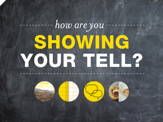
Braid’s visual system evolved from Kathleen’s blog – most specifically, how she shared her life-changing trip to Nepal. Her “bold yellow or white type and graphics overlaid on travel photography” style morphed into Braid’s “bold yellow or white type and graphics overlaid on one well-loved chalkboard wall” style. It’s simple, it’s straightforward, and its become an absolutely essential piece of our content-sharing puzzle. We use it across every platform we share on – our blog posts and on our Facebook wall – so you always know Braid content the moment you see it.


Your visual consistency should also carry over to platforms other than your blog. Instagram is a great way for visual people (especially photographers and stylists) to showcase their eye.
Photographer Jason Hudson wrote about a great guide for creating lovely, personal-brand-solidifying consistency on Instagram here. One tip is to limit yourself to one filter (Jason prefers the moody, desaturated Brannan), so that regardless of what you’re capturing, all your images will have a similar tone and palette. It’s an easy way to stay consistent without having to think about it constantly.
Did you know, for example, that Kathleen exclusively uses the Rise filter on her Instagram? I didn’t, until recently. It gives everything she posts this kind of soft, early-morning zen glow, and tints everything with a little bit of the yellow that’s so prevalent on her blog. I feel like a kid in a vintage-filter candy store every time I go to post something – so I’m impressed by her ability to limit herself to just one filter. Consistent!
Okay, but if the idea of getting your words equally consistent still appeals to you, we’re gonna agree: the pairing of the visual with the verbal is really going to really give you the greatest content memorability.